Davi Paula
Senior Product Designer

My Role: Senior Product Designer (Focus on UI, Research, and Facilitation).
Team: 1 PM, 1 Tech Lead, and 3 Engineers.
Company: Hurb (Online Travel Agency).
Product: "Trending Products" section on the website’s homepage.
Results: 19% increase in conversion over a 2-week A/B Test with 94% confidence.
A sea of possibilities (and uncertainty)
Think back to the last time you planned a trip. It’s a moment driven by dreams, but it quickly hits the wall of "choice anxiety." Where to go? Where to stay? What’s the best deal? The role of the Hurb homepage has always been to try and answer those questions.
In early 2024, the online travel market was gaining momentum, and we had to keep up. As a newly formed squad, we were handed a mission with high ambiguity: improve the home experience to drive conversion. There was no pre-digested problem, nor a predefined solution. Just a business goal and a page that was "sacred ground" for multiple stakeholders.
We knew a bold redesign project from the previous year had failed due to strong internal resistance to drastic changes. So, we asked ourselves: How do we evolve one of our core business experiences without breaking the trust of those who build it every day?
Our premises
Great designs usually have a target. Instead of revolutionizing the entire page, we decided to iterate. Alongside our GPM, we established three guiding principles:
Quick Wins: We would take one step at a time, ensuring adoption and continuous support.
Conversion Focus: Every initiative had to bring the traveler closer to a purchase decision.
Phased Deliveries: Isolate variables so we could measure impact accurately.
From chaos to consensus
Mature design work requires "getting your hands dirty" before opening Figma, and my favorite way to do that is through collaboration. I shared the Discovery front with my PM: I dove into the cold numbers of GA4, watched dozens of user sessions on Clarity, revisited recent research, and evaluated the interface and journey; she delved into secondary research, conversion best practices, and the competition.
But data alone didn't tell the whole story. We needed the human voice.
I planned and facilitated a workshop with stakeholders (Growth, Creative, Product, Business, and PR). Instead of presenting screens, I presented problems and opportunities—and I listened. Together, we defined that the homepage needed to deliver three things: Dreams (context), Trust, and Conversion. From this alignment, 10 prioritized initiatives were born. The first one tackled a classic human behavior: the bandwagon effect.
The Hypothesis: Our customers are heavily influenced to buy trips to destinations that are already popular within their social circles. If we can make that tangible on our storefront, we can shorten the decision-making process.
Real Life: Trade-offs and Construction
The idea was to create a "Trending Products" section, applying the Framing Effect to simplify choice. However, execution required full collaboration from the triad for key decisions:
What defines "Trending"? In our discussions, our PM was instrumental in making the call and calibrating this definition. We didn't just want "most viewed"; we wanted "best sellers."
Where does the data come from? Our Tech Lead discovered we already had the sales data, but we needed to index it for homepage use.
How to keep the section fresh? Analyzing sales data, I noticed that daily fluctuations were too noisy. I decided on 7-day rolling windows to ensure a ranking that balanced consistency with freshness.
I explored numerous visual variations, testing layouts until I found the perfect balance between consistency and contrast. The new section needed to stand out from the others while looking like it belonged on the site. Information density, visual appeal, and differentiation were the focus of these explorations. Below are some of the options discarded during this process:


The Proposal: A new starting point
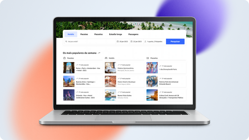
The result delivered was a living, light, and powerful section that adapts gracefully from a large monitor to a smartphone screen.
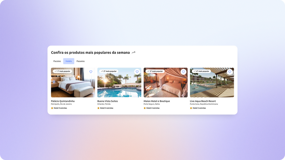
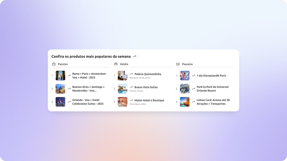
Discovery at a glance: I separated content into clean columns (Packages, Hotels, Tours). The traveler sees the Top 3 of the week and, with one click, lands directly on the product page to start the checkout flow. No labyrinths.
Silent intelligence: This was our first homepage section to be 100% automated, removing manual labor from the Growth team and delivering a consistently fresh storefront for the traveler.


Looking to the future (and the metrics)
Good design is a conversation that ends in business. To prove the value of our delivery, I designed the A/B Test structure, defining hypotheses, success metrics, and guardrails, and validated it with our Data partner.
The results spoke for themselves: after 2 weeks of testing, we reached 94% statistical confidence and drove a 19% increase in overall site conversion.
Beyond metrics, this project was a testament to the team's maturity. We learned that involving stakeholders from "Day Zero" turns skeptics into advocates. We saw that the synergy between Design, Data, and Engineering is what separates a "pretty layout" from a product that delivers results.