Davi Paula
Senior Product Designer

My Role: Product Designer (focus on Research, UX/UI, and Validation).
Team: 1 PM, 1 Tech Lead, 4 Engineers.
Company: Rock Content.
Product: A capacity management dashboard for Studio, a SaaS platform for agencies and marketing teams to manage projects, campaigns, and finances.
Results: 75/100 satisfaction score, increased retention and engagement across 30+ accounts, and 3 plan upgrades immediately after launch.
The silent pain that cost 6 hours per week
Every product has a promise. Studio’s vision was to be the command center for agencies and marketing teams to manage their operations. However, there was a dangerous gap between our vision and reality: we were great at managing tasks, but our users needed to manage people.
We heard the alarm when we realized the risk of being replaced. Customers lacked team-level management tools and started looking at competitors. More importantly, team leaders were wasting valuable time: they were leaving Studio and spending up to 6 hours per week updating external spreadsheets just to understand who was overloaded and who was available.
The mission became clear: we needed to bring team management into the product, regain competitiveness, and retain customers.
Our guiding stars
Strategic design starts with alignment on the business problem. Before designing any screens, I facilitated a workshop with Product stakeholders to map existing knowledge and define a research plan. We knew that to succeed, we needed three pillars:
Empathy with the chaos: Understanding the daily reality of managers dealing with deadlines, urgencies, and delays.
Flexibility to build: This would be Studio’s first initiative using a modern front-end framework.
Frictionless adoption: The solution needed to be intuitive and straightforward, inspired by best-in-class market patterns.
Deconstructing the problem
I partnered with the Customer Success team to recruit the right users and conducted in-depth interviews. In parallel, I analyzed how the competition was solving this pain point.
Using the Atomic Research methodology alongside my PM, I connected the dots: we mapped 128 facts, explored 11 themes, and generated multiple insights. We discovered that the acute pain occurred during weekly planning (Mondays and Fridays) and during quick course corrections when unforeseen events and absences happened.
This reframed our problem into a central question: How might we help managers determine how, when, and to whom tasks can be assigned, using only Studio?
Real Life: Trade-offs, Validation, and Refinement
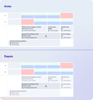
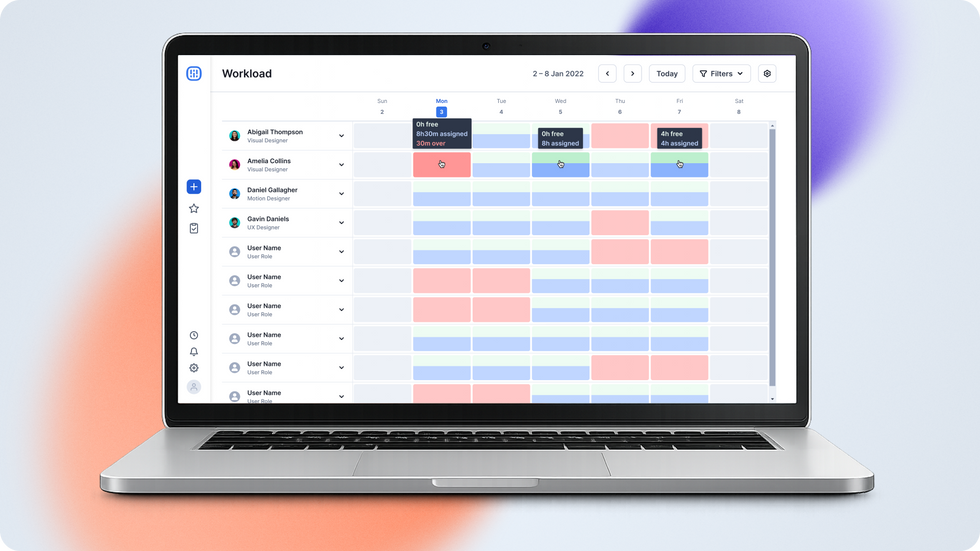
With multiple opportunities on the table, I proposed frameworks and prioritized with the PM and Tech Lead what would deliver the most value with the best feasibility. I explored interface concepts, and we decided to move forward with a detailed view of each day of the week (Image 2), as it was more intuitive and competitive than the consolidated view.


But a design rarely survives its first contact with the user without some scars. I took the proposal to 5 users for perception testing early in the process.
What I heard: They understood the overall chart. However, they confused task titles with project titles and had trouble understanding the distribution of hours per day. Some even thought the color red meant a "fully booked" day.
How I iterated: I removed the task title from the sidebar and moved it inside the card. I included not only the estimated time but also the time distributed per day. I also created an onboarding flow for first-time users.
To polish the interface, I took the project to a Design Critique with the Design Chapter. That's where I changed the bar chart orientation from horizontal to vertical (better conveying the idea of a day "filling up"), sacrificed highly specific designs for 1-day tasks in favor of overall consistency, and added a fade effect to focus the user's attention on the card they are interacting with.


Creating a smooth workflow for engineering
Collaborating with engineering taught me that a design is only as good as its buildability. I delivered a meticulous handoff, documenting interactions, business rules, validations, and visual specifications in Figma. And, since real life demands speed, I split the handoff into 3 files, one for each phase defined alongside the PM.
Promise Delivered


The Workload feature was launched, and the results showed the true power of design connected to business goals:
Satisfaction: We hit a 75/100 CSAT score, packed with positive feedback.
Retention and Engagement: Over 80 managers from 35 clients started using the dashboard daily. This included saving customers who were already considering migrating to competitors.
Monetization: The feature became an exclusive perk of our highest tier, helping to prospect 3+ plan upgrades right after launch.
Looking back: Testing early ensured better negotiations and rapid validations. However, the biggest takeaway was about initiative and collaboration: from the stakeholder workshop to the implementation plan, I realized how designers can go beyond the interface, act as facilitators, and influence decision-making by positioning themselves as strategic partners.