
Workload: Enabling managers to allocate resources smartly
A strategic feature to help managers using Studio to plan and manage their team’s workload
Back in late 2021, the Studio team was working on defining the product vision and strategy. Within the new value proposition, one theme was still missing: people and work management. As the product designer for Studio, I was resposible for discovering and desiging a brand new feature to cover that space and bring the product closer to its vision.
Company
Rock Content
Year
2022
Team
1 Product designer
1 Product manager
2 Front-end engineers
4 Back-end engineers
Skills
User Research
Interaction Design
UI Design
User Testing
Product Mindset
The audience
Team and project managers from agencies and marketing teams using Studio worldwide.
Project managers from an internal team using Studio to collaborate on projects and campaigns.
The problem
We realized the importance of focusing on people and work management when the manager of Ion Expert Services informed us that he was spending over six hours a week maintaining a spreadsheet with his team's tasks and durations. Without a way to visualize his team's workload in Studio, he was left to rely solely on the spreadsheet to plan services, assign responsibilities, and track deadlines. The extra work was taking a toll on his productivity and he considered reverting to a previous tool. In addition, during an interview with another manager from an agency using Studio, we were shown a competitor's tool with a workload feature that he wished was available in our product. These interactions highlighted the need to address user needs in the area of people and work management or risk losing our users.
The research
As we were entering a brand new space, I found it valuable to plan and facilitate a CSD matrix workshop with the product team to map our existing knowledge and questions. The workshop revealed that we had more to learn than we thought, and was crucial for me to develop a research plan.
To learn more about our users and the theme of the project, we conducted user interviews with managers from agencies and marketing teams to explore the concepts of workload management, its measurement, the thought processes for dealing with tasks, missed deadlines, employee absences, and more.
After collaboratively analyzing the data collected with my PM, we identified, out of 128 data points, 11 themes, and 40 insights. To help in the analysis work, we used the Atomic Research Framework, creating clear connections between the Facts obtained in user interviews and the Insights and Opportunities generated.

Some of our key insights were:
Theme: Effort concept
Most managers measured the tasks' effort by working hours because of how they charged for their services. Some measured it based on complexity because they lacked historical data.
Theme: Booked agenda.
Managers need real-time visibility on who is available to absorb new tasks as they arise and need to be prioritized.
Although working extra hours is common to deliver an urgent or delayed task, managers tend to avoid it and instead change task dates and owners.
Managers recognize that employees are not productive for the entire workday. Therefore, their agenda is considered booked before it reaches the limit of daily working hours.
Theme: Workload control
Managers were using spreadsheets, tools, and direct messages to control and communicate the workload of each employee because Studio did not offer a way to do it.
Those who used Studio for workload control relied on intuition, and previous experiences, and sometimes asked task owners about a given task’s effort.
Those who used spreadsheets for workload control relied on historical data and had a more robust analysis in place.
Disclaimer: We hold most of the insights from this case to preserve the privacy of information.
After learning more about our users, we had a clear challenge:
How might we help leaders to know how, when, and to who they could assign tasks, while only using Studio to manage their employees’ agenda?
The solution design
After a few ideation and prioritization sessions with my PM, I explored concepts for a new feature that employed the learnings from research and competitive analysis.
Wireframe:
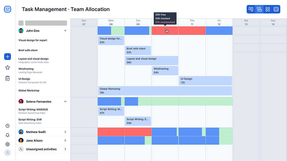
The concept was a dashboard that enables managers to understand employee workload at a glance and included assigned tasks, estimated durations, and availability.

List of all employees
Weekly chart view
A bar chart at each day for each employee, where blue represented the booked percent, green the free percent, and red the overbooking of the day.

Ability to view the tasks assigned to each employee for the week
Estimated duration and start and due dates for the tasks.
Ability to view the exact number of assigned and free hours per day, per employee
User testing
To validate the design, I decided to increase the wireframe fidelity to conduct perception testing sessions with end-users.
Although users were able to understand the visual charts and the design worked the way they expected it to, they initially confused task names with project names and misunderstood the red bar as a fully booked day.
Based on test results, we made improvements to the design, such as adding the project name as a third piece of information to the task card—as users said that it would help them to retrieve the task context—and removing the task name from the left-side panel. We also added an onboarding experience to introduce users to the new feature and the meaning of the colored bar charts.
After testing and iterating, we increased the fidelity of the designs to high and started creating the UI components for the project. Although the Workload used the design tokens and components from our Design System, Reverb, it also required multiple new and complex components to build the desired view and experience.

Design critique
As we moved to high-fidelity designs, I still wanted to find opportunities to polish them. By hosting a design critique session with Rock's Product Design team, we obtained additional feedback that resulted in 3 further improvements.
Change in bar chart orientation
Following the team's feedback, we changed the bar chart orientation to vertically growing bars, better indicating that the tasks assigned were filling the day until its limit.

Change in single-day task card
Initially, the task card for single-day tasks was designed differently from the others. It displayed the task details on the UI instead of truncating them. However, my team recommended maintaining the same card design for consistency and using tooltips to display truncated information.

Fading of other cards when hovering
This was also a team's suggestion: We modified the UI to fade other cards slightly when hovering over a given task card, enabling users to focus on their area of interest.

Technical constraints
Due to technical constraints, the weekly chart could not be an infinite scrolling chart. Because of it, we needed to find a way to communicate tasks that were either starting in the previous week or ending in the next. To tackle this issue, I conducted a rapid analysis of how similar products were handling similar situations and devised a new task card design to provide a solution.

In order to validate the effectiveness of the new design, I planned and conducted a series of perception testing sessions with end-users. The results were highly encouraging, as all participants demonstrated a clear understanding of the arrows denoting the start or end of a task on the card.
Final design
After continuously iterating the design based on test results and feedback from the team, we arrived at the first version and I meticulously documented it for handoff to the engineering team, to which I also provided close support during the development phase.
In the video below you can view a quick snapshot of the final design. For detailed screenshots, please, navigate to the project gallery at the end of this case.
The GTM Strategy
Because the Workload was a brand new feature and we planned to implement it in small packages, my PM and I decided on a Beta launch as a go-to-market strategy, so we could deliver fast and get feedback early.
We selected a group of users that were the target audience for the feature and released the Workload only for them. For the course of a couple of months, these users were enrolled in a beta tester program where they used the Workload dashboard and regularly shared their feedback with us. Which resulted in the following iterations and enhancements:
We added the ability to filter by employee or department.
We added the capability to edit tasks directly from the dashboard.
We created a new feature to allow users to unevenly split the duration of a task, enabling them to decide how much time each task should take per day.
The outcomes
The Workload feature is currently used by more than 80 daily active users from 30 agencies, with a CSAT score superior to 75. Besides that, it has already assisted in prospecting subscription upsells through our pricing strategy.
My learnings
This project presented both interaction and UI design challenges that I loved tackling, as I explored complex concepts and turned them into simple and intuitive UI for users.
Throughout this journey, I’ve also reaffirmed the value of making informed design decisions by testing early and often with users and seeking feedback from my design peers.
Finally, looking back, there are a few things I would have done differently:
Would have worked to propose more robust ways to measure success to my project manager. While we had DAU and CSAT metrics, I feel like we missed out on tracking impact too.
Would have considered the guidelines of the WCAG to build an accessible design from the outset. During this project, I was not yet specializing in accessibility. Luckily, it has now become a requirement for all my design projects.
Project Gallery


